Themes & appearance
A chart often needs to match the rest of an app: its background, rising and falling colors, typography and labels. Start with theme to set the shared colors. Use appearance when one part of the chart needs a different treatment, such as a larger price label or a rounded tooltip.
For example, a light screen can set a white background and dark axis text in theme, then give the tooltip a border through appearance.tooltip. An explicit appearance value overrides the corresponding theme color; other parts keep their theme defaults.
Colors use #RRGGBB or #RRGGBBAA, where the final two digits set alpha. The tables below list the shared colors and the parts you can style separately.
Theme
These colors act as shared defaults. Set the few that need to match your app; omitted values keep the defaults below.
| Property | Type / values | Default | Description |
|---|---|---|---|
backgroundColor | Color | #100C18 | Chart background. |
gridColor | Color | #292431 | Grid fallback. |
axisTextColor | Color | #9791A5 | Axis, extrema, and some additional-series fallback text/color. |
upColor | Color | #38D98A | Rising-series fallback. |
downColor | Color | #FF3B64 | Falling-series fallback. |
crosshairColor | Color | #A8A2B3 | Crosshair line and badge fallback. |
tooltipBackgroundColor | Color | #1B1723 | Tooltip background fallback. |
tooltipTextColor | Color | #F5F2FA | Tooltip text fallback. |
Appearance groups
Each group controls one part of the chart. For example, candles sets body colors and corner radius, while tooltip controls its panel and text.
| Property | Type / values | Default | Description |
|---|---|---|---|
backgroundColor | Color | theme.backgroundColor | Role-specific background override. |
grid.color | Color | theme.gridColor | Grid color. |
grid.opacity | Number from 0 to 1 | 0.75 | Grid alpha multiplier. |
candles.upColor / downColor | Color | Theme direction colors | Candlestick colors and bar fallbacks. |
candles.radius | Non-negative number | 0 | Candlestick body corner radius. |
bars.* | Bar appearance | Candle colors, width 1 | OHLC bar presentation. |
line.* | Line appearance | Theme up color, width 1.5 | Main line presentation. |
area.* | Area appearance | Theme up color, width 1.5 | Main area outline and fill. |
xAxis.text / yAxis.text | ChartTextStyle | theme.axisTextColor | Native axis text styles. |
priceExtremes.* | Text and colors | Axis/background colors | Visible high/low label presentation. |
currentPrice.* | Line and directional badge | Active-series colors | Latest-price presentation. |
crosshair.* | Line and badges | theme.crosshairColor | Selection line and axis badges. |
tooltip.* | Text, colors, opacity, border | Tooltip theme colors | OHLCV tooltip presentation. |
Text, badge, and border properties
| Property | Type / values | Default | Description |
|---|---|---|---|
text.color | Color | Role fallback | Text color. |
text.fontFamily | Non-empty string | Platform monospace | Font already bundled by the consuming application. |
text.fontSize | Positive number | Native role default | Points on iOS and scaled pixels on Android. |
text.fontWeight | 'regular', 'medium', 'semibold', 'bold' | Native role default | Requested font weight. |
badge.backgroundColor | Color | Role fallback | Non-directional badge background. |
badge.upBackgroundColor | Color | Active up color | Current-price badge background for rising candles. |
badge.downBackgroundColor | Color | Active down color | Current-price badge background for falling candles. |
badge.text | ChartTextStyle | Role fallback | Badge text style. |
badge.border | ChartBorderStyle | Transparent, width 0 | Badge border. |
border.color | Color | #00000000 | Border color. |
border.width | Non-negative number | 0 | Border width. |
border.radius | Non-negative number | 4 for badges, 8 for tooltip | Corner radius. |
Overlay appearance properties
| Property | Type / values | Default | Description |
|---|---|---|---|
priceExtremes.text | ChartTextStyle | Axis text style | High/low text. |
priceExtremes.connectorColor | Color | Axis text color | Connector line. |
priceExtremes.backgroundColor | Color | Chart background | Label backing color. |
currentPrice.line.upColor / downColor | Color | Active-series colors | Current-price line colors. |
currentPrice.label | ChartDirectionalBadgeStyle | Active-series backgrounds | Current-price badge. |
priceLines.label.border.radius | Non-negative number | 0 | Corner radius of custom price-line axis badges. |
crosshair.line.color | Color | theme.crosshairColor | Crosshair line color. |
crosshair.line.opacity | Number from 0 to 1 | 0.85 | Crosshair line opacity. |
crosshair.priceLabel / timeLabel | ChartBadgeStyle | Crosshair-colored background | Crosshair axis badges. |
tooltip.backgroundColor | Color | theme.tooltipBackgroundColor | Tooltip panel color. |
tooltip.backgroundOpacity | Number from 0 to 1 | crosshair.tooltipBackgroundOpacity | Tooltip panel opacity. |
tooltip.headerText / labelText / valueText | ChartTextStyle | theme.tooltipTextColor | Tooltip typography. |
tooltip.positiveValueColor / negativeValueColor | Color | Active-series colors | Directional value colors. |
tooltip.border | ChartBorderStyle | Transparent, width 0, radius 8 | Tooltip border. |
Axis regions do not automatically grow for larger fonts. Increase xAxis.height or yAxis.width when a custom style needs more space.
Light theme example
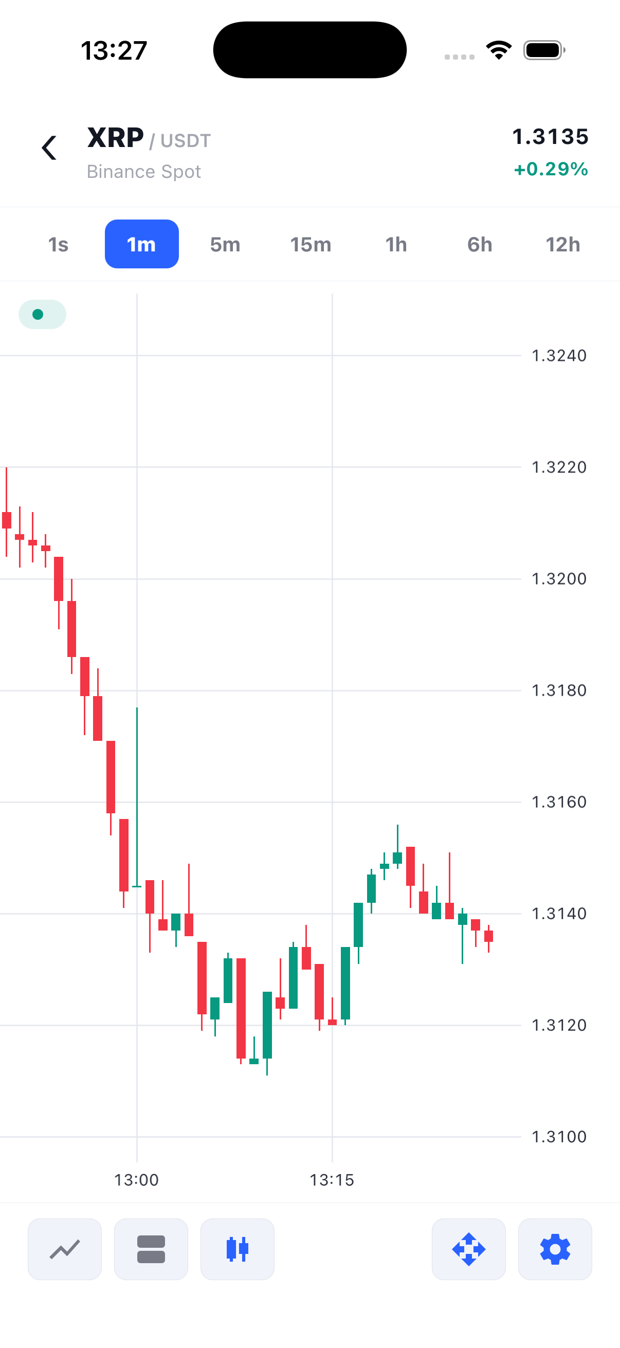
Explicit appearance values override the related theme fallbacks. Additional line/area series can also set their own appearance on the series options.
import { useEffect } from 'react';
import {
  TradingCharts,
  TradingChartsView,
  type OhlcCandle,
} from 'react-native-trading-charts';

// Deterministic sample data. Replace this with your market-data feed.
const history: OhlcCandle[] = Array.from({ length: 80 }, (_, index) => {
  const open = 100 + Math.sin(index / 5) * 8;
  const close = 100 + Math.sin((index + 1) / 5) * 8;
  return {
    timestamp: 1_720_000_000_000 + index * 60_000,
    open,
    high: Math.max(open, close) + 2,
    low: Math.min(open, close) - 2,
    close,
    volume: 10 + index,
  };
});

const chartId = 'styling';

export function Example() {
  useEffect(() => {
    TradingCharts.setHistory(chartId, history);
  }, []);

  return (
    <TradingChartsView
      style={{ height: 420 }}
      chartId={chartId}
      theme={{
        backgroundColor: '#FFFFFF',
        gridColor: '#E2E8F0',
        axisTextColor: '#475569',
        upColor: '#009E73',
        downColor: '#E64966',
        crosshairColor: '#64748B',
        tooltipBackgroundColor: '#FFFFFF',
        tooltipTextColor: '#0F172A',
      }}
      appearance={{
        candles: { radius: 2 },
        grid: { opacity: 0.5 },
        yAxis: { text: { fontSize: 12, fontWeight: 'medium' } },
        tooltip: { border: { color: '#CBD5E1', width: 1, radius: 10 } },
        crosshair: { priceLabel: { text: { color: '#FFFFFF' } } },
      }}
      yAxis={{ width: 80 }}
    />
  );
}